Impact | Emotion | Hope
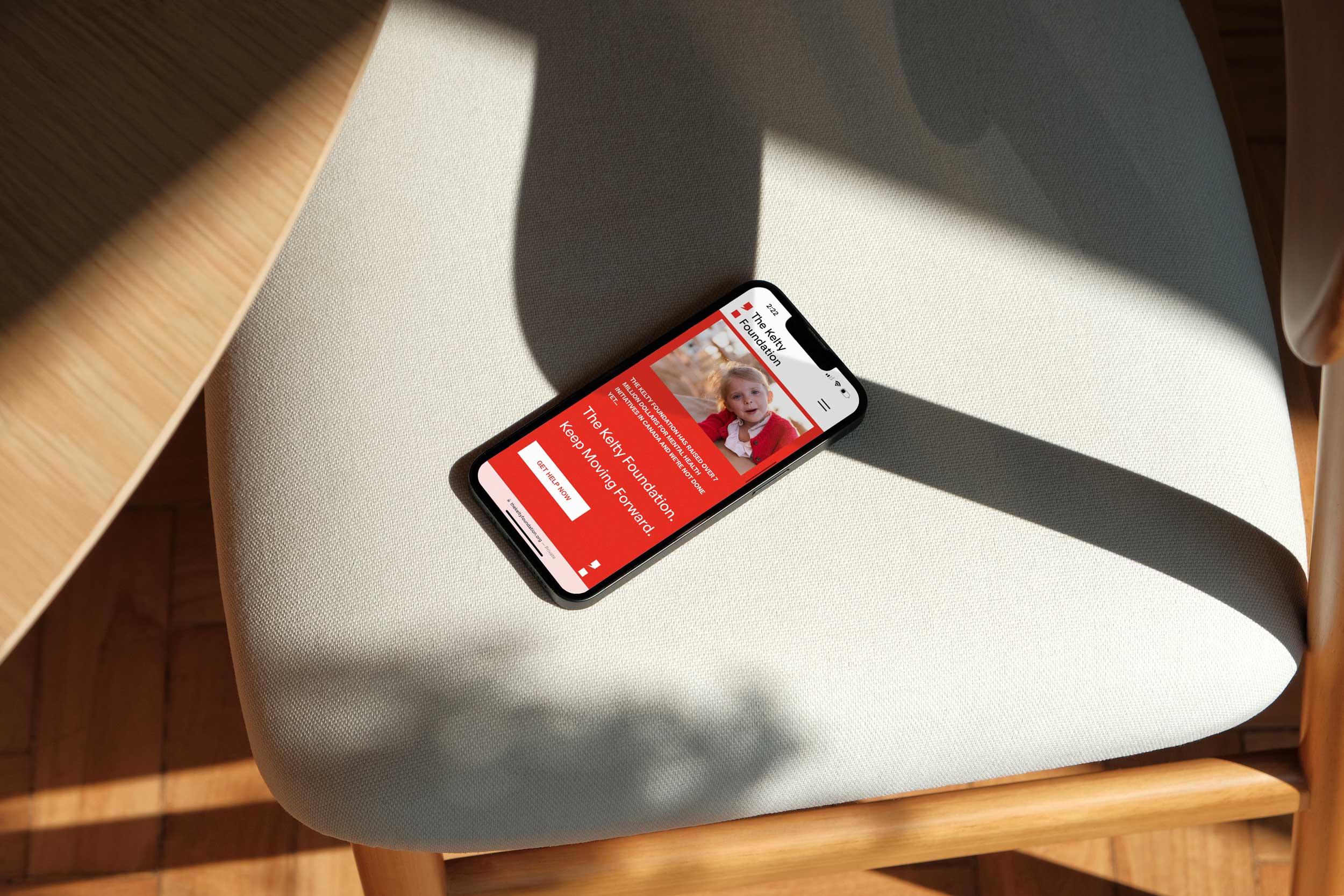
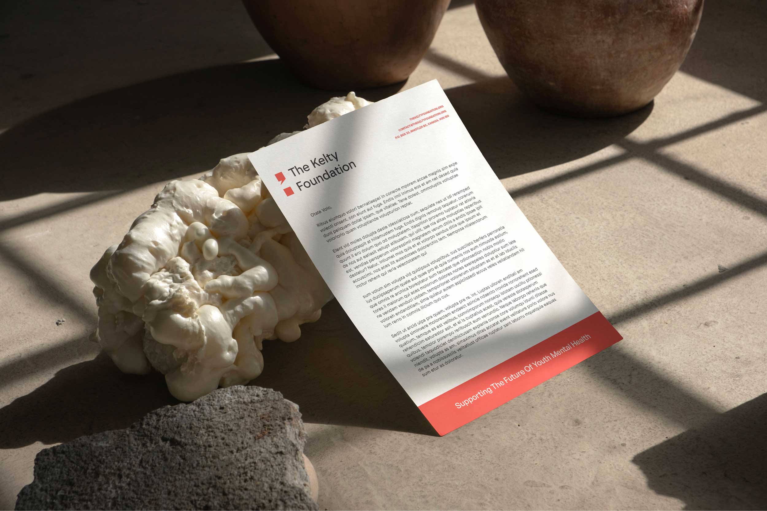
Brand Development, Marketing Materials, Web Design
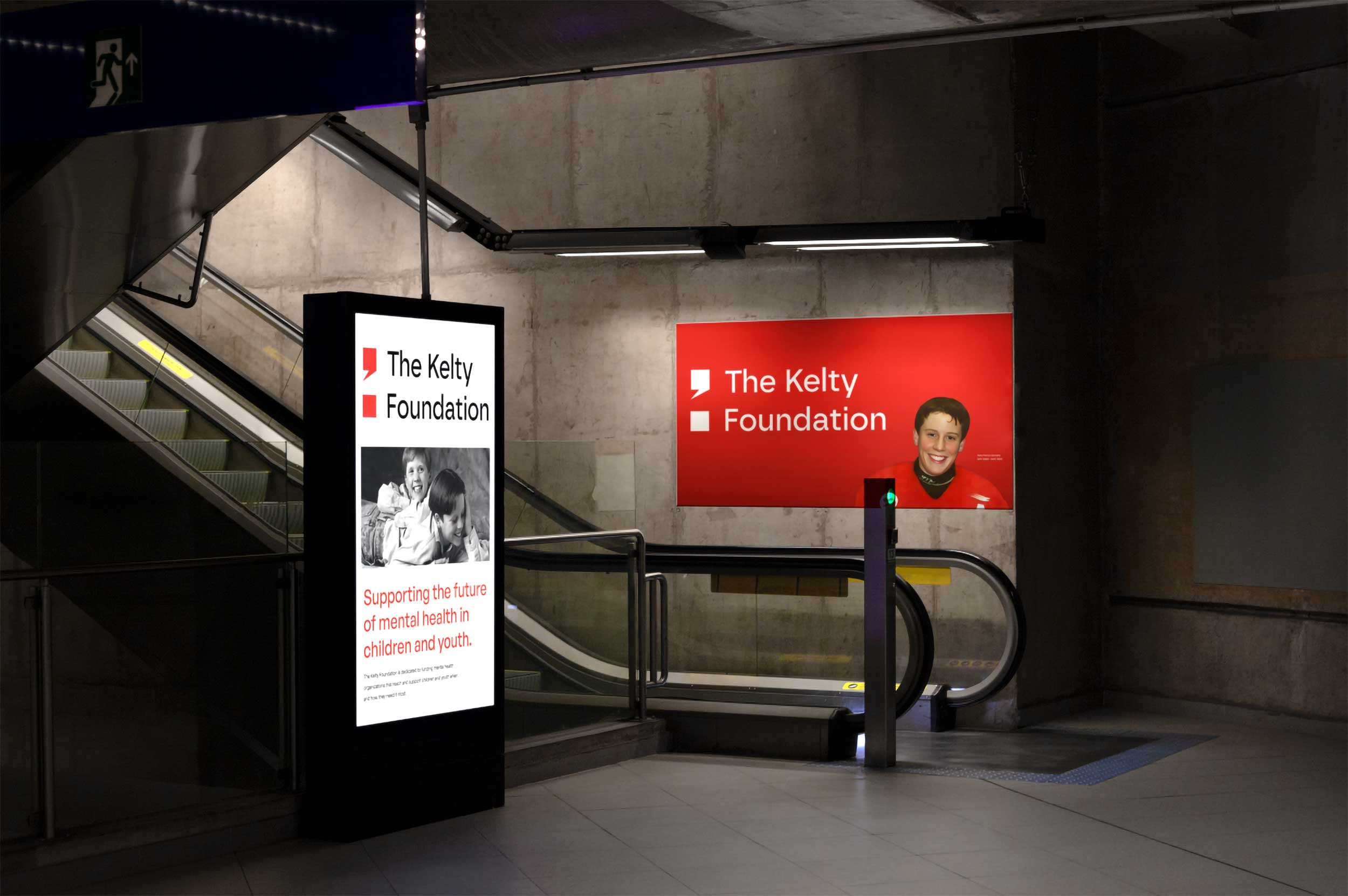
A non-profit organization founded in 2001 dedicated to improving youth mental health access and prevention.
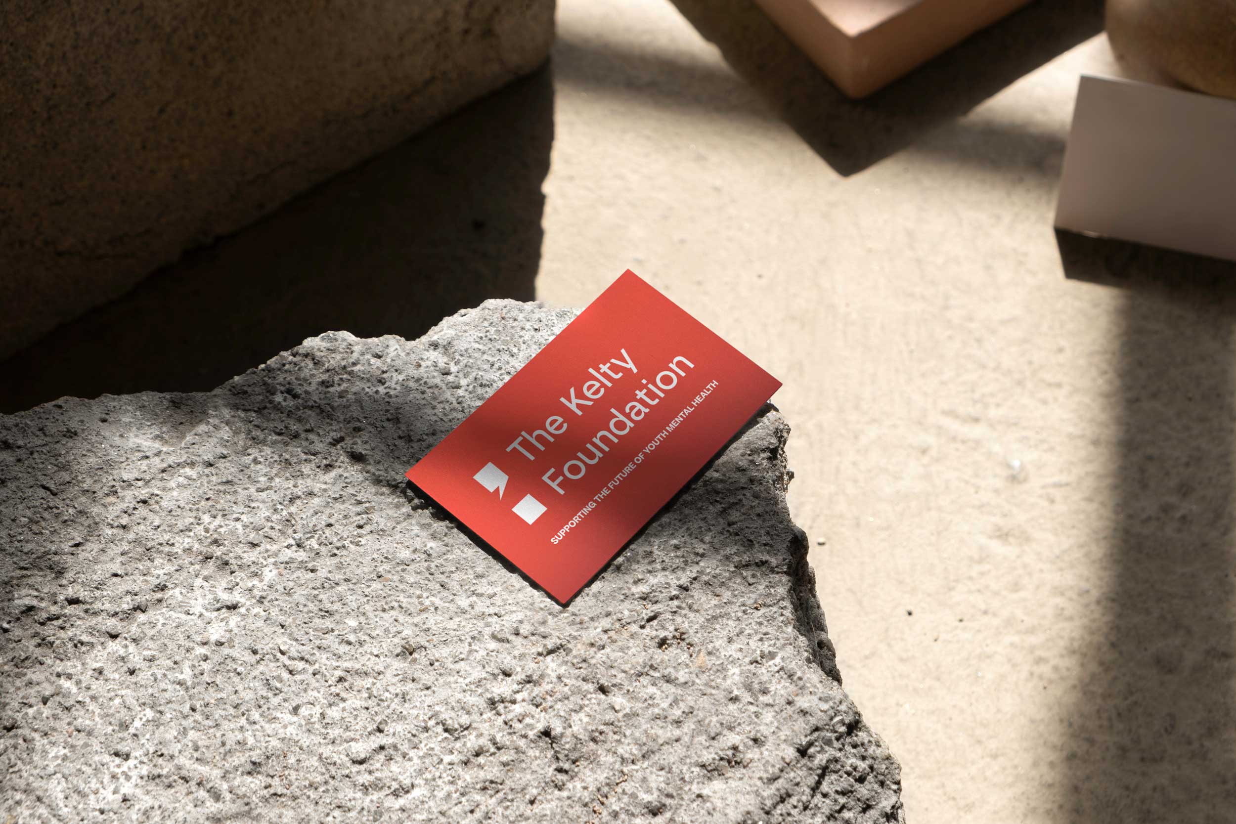
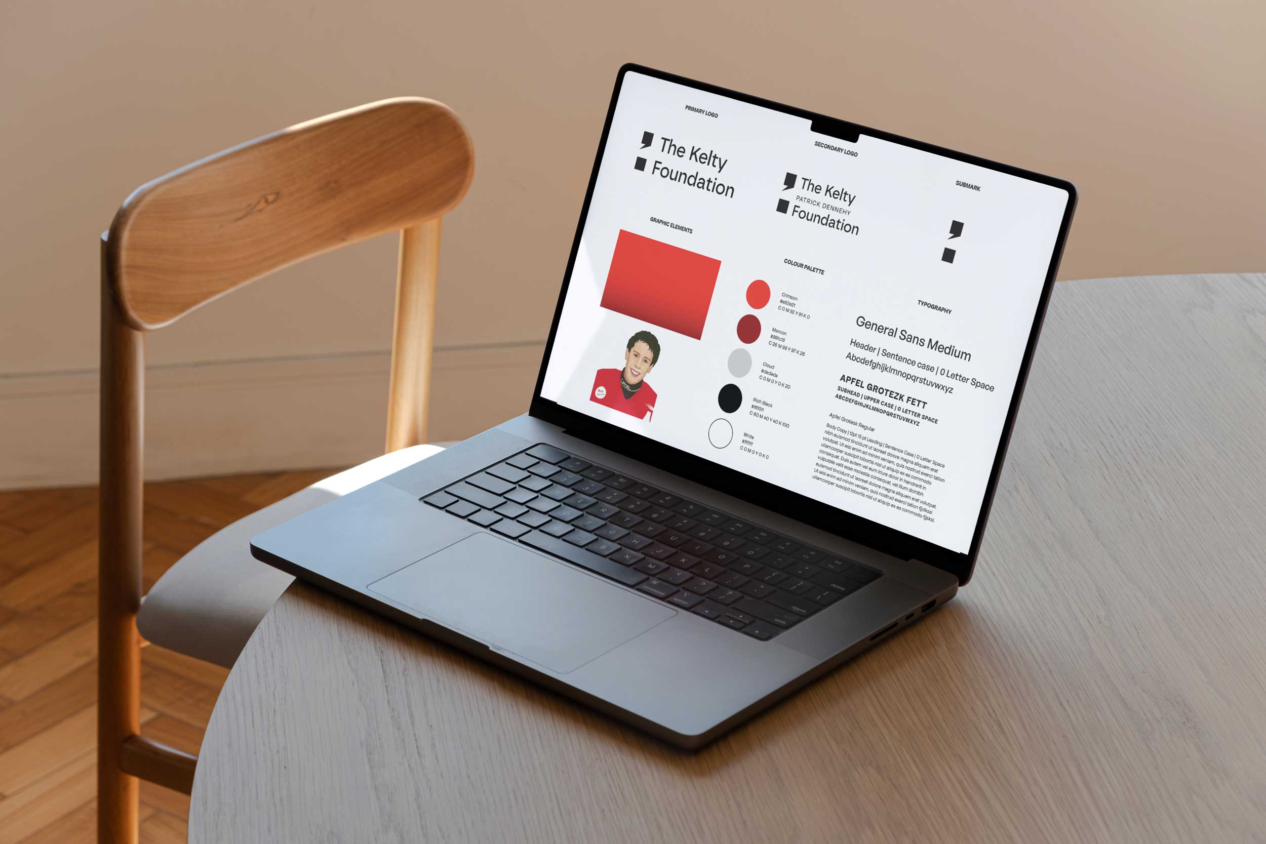
The semicolon carries global recognition as a powerful symbol for mental health, signifying the choice to keep moving forward—that there’s still more to come.
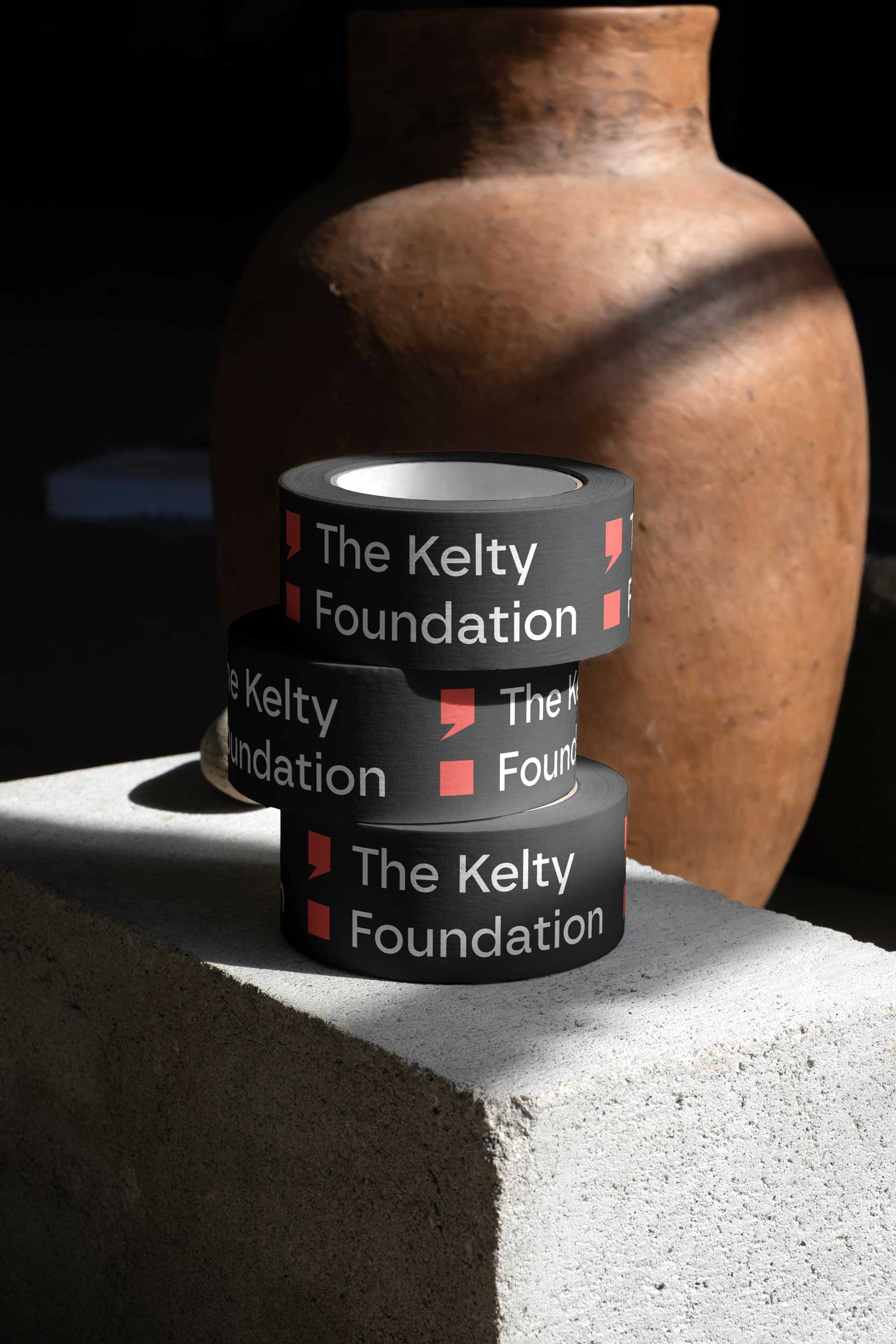
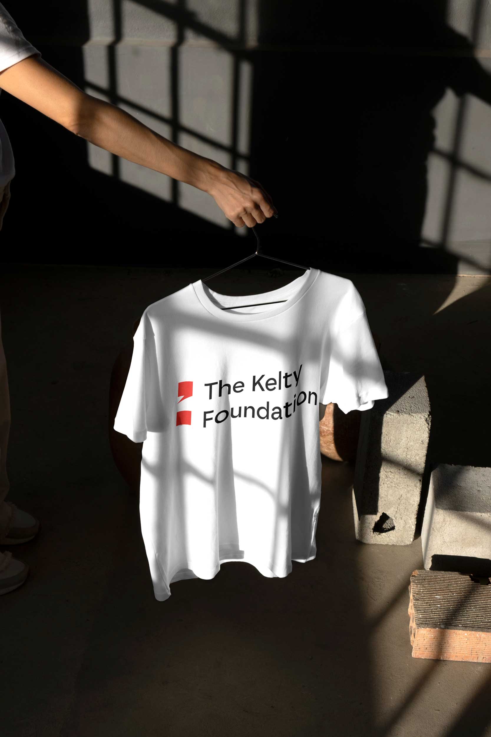
For this rebrand, we transformed the semi colon into a bold, modern statement that represents upward momentum, hope, access to community, information, and support.
