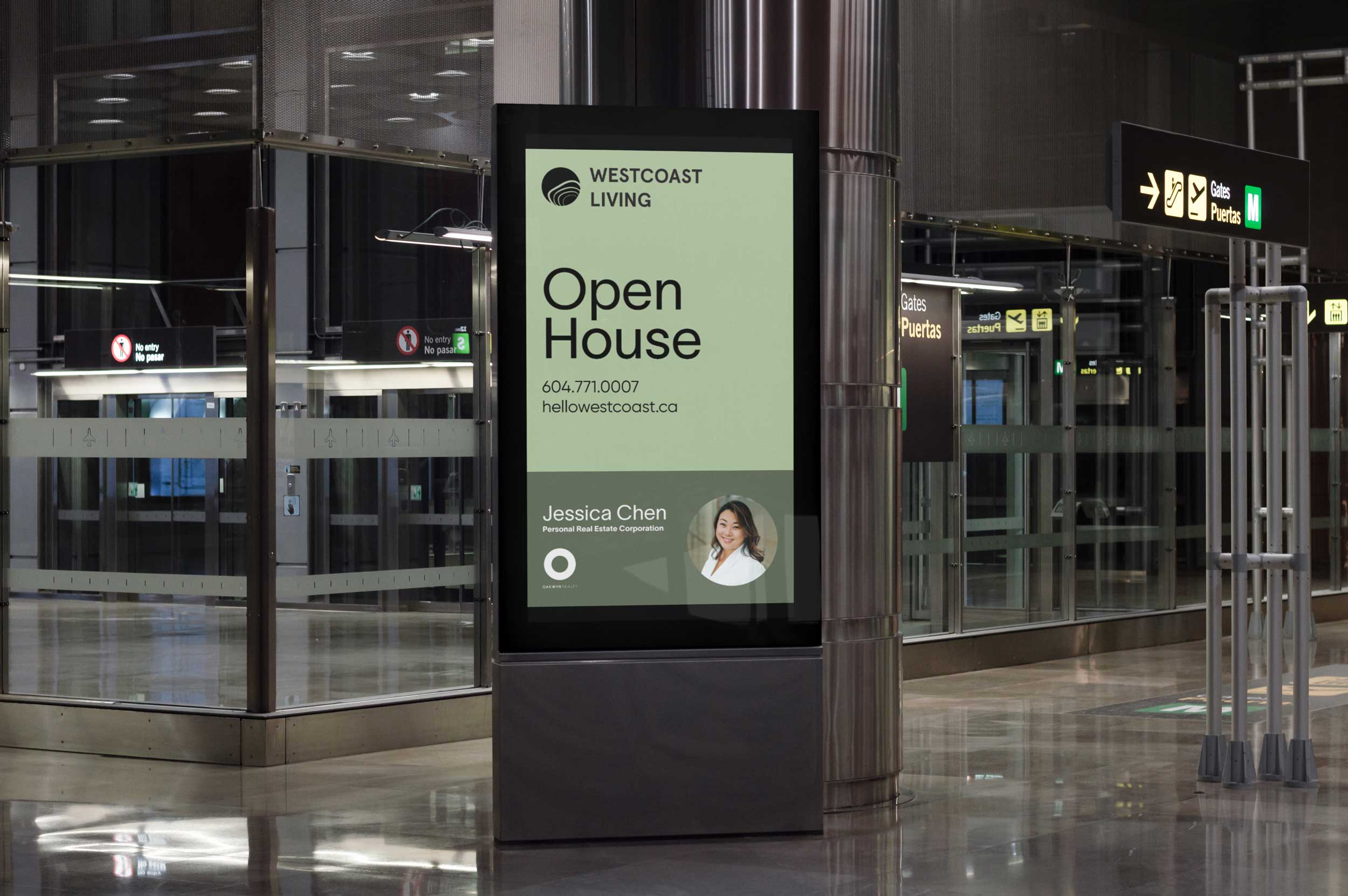
West Coast Living wanted to refresh their brand identity, looking for a strategic progression that aligned the brand with its roots while still departing into a fresher, more contemporary feel. They sought to convey their teams honest, down-to-earth ethos, emphasizing that success is defined by long-term relationships and positioning themselves as your realtors to grow old with.
At the heart of this brand evolution lay a commitment to progress, a journey from roots to new horizons.
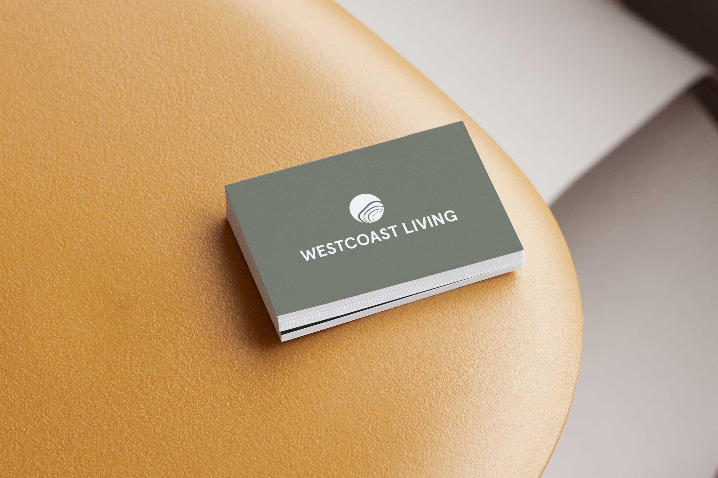
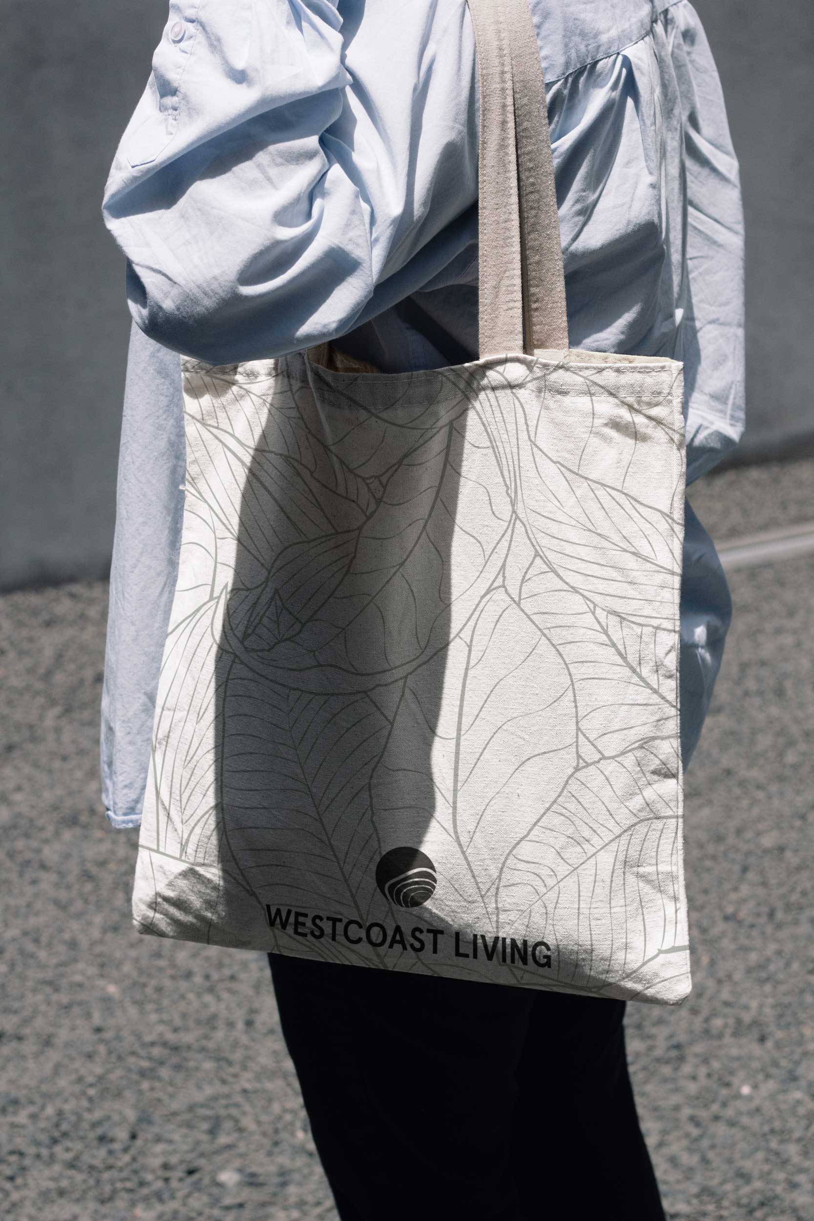
We steered away from the familiar forest greens that once defined this brand, embracing a palette that mirrors the vibrancy of the Pacific Northwest—evergreen, usnea moss, white, and black.
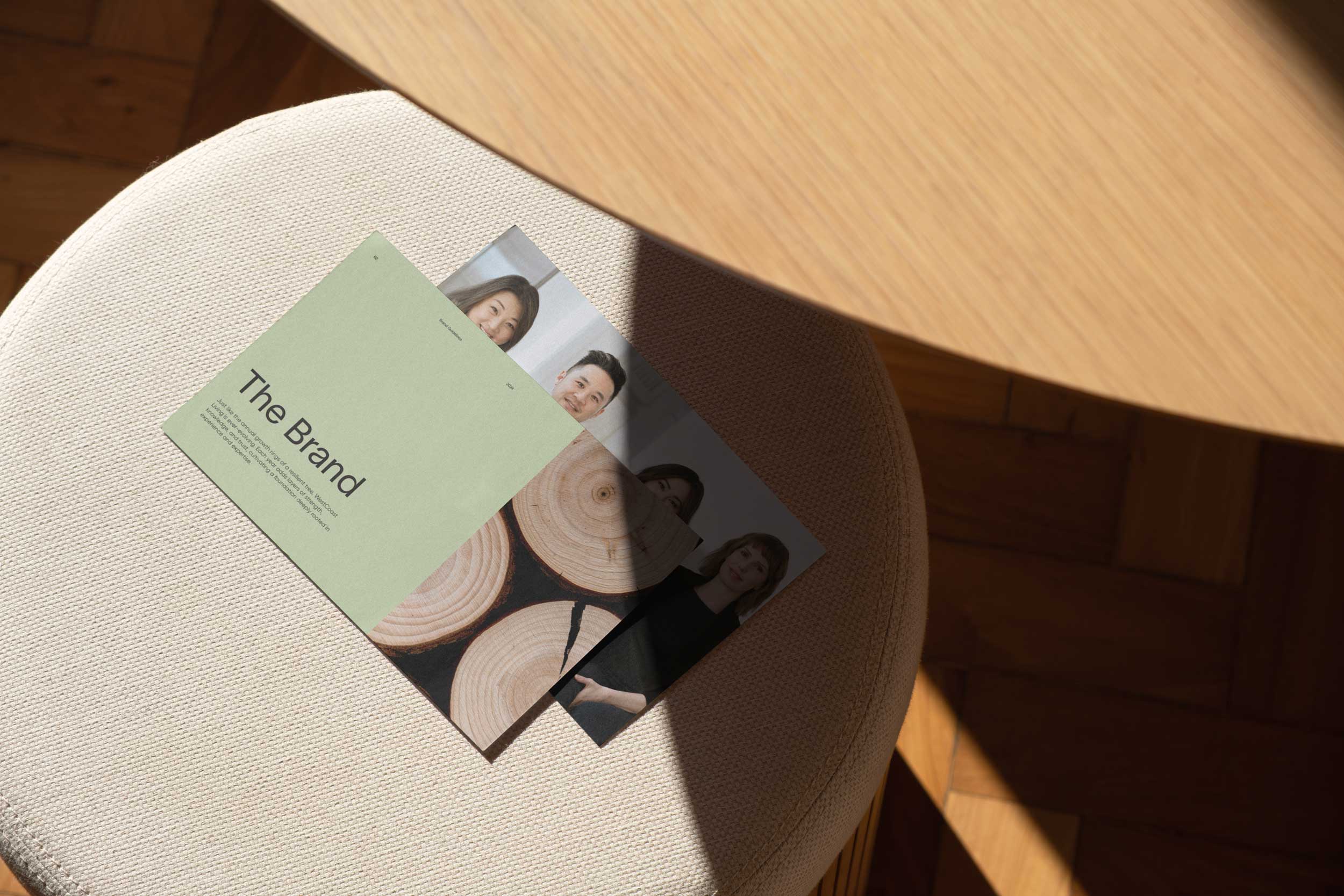
We evolved the logo suite to feature a bold, abstract, and unique illustration of tree rings to signify a new chapter for the agency—the rings representing a story of growth, evolution, and enduring values.
This brand is not just crafted to keep up with the times but to build a legacy of trust that spans generations within the unique Vancouver market.
West Coast Living is a story for generations to come—a place to return to, a place where your children and grandchildren can build their future, a place that welcomes you into our family tree. We are your realtors to grow old with.